
Business Journal’s Leadership Trust is an executive networking community that is comprised of Presidents, Owners, and C-suite executives in 46 local markets. Each market is treated like a separate community to help members establish strong relationships and build a brand presence to maximize the impact they can make in their local communities.
The challenge:
Post-pandemic, BJLT community growth was suffering due to its impact on many local businesses, and the state of the brand and website wasn’t helping. Our goal was to rebrand, modernize the website, and improve search visibility.
The brand was almost all black and white, and the website didn’t do a good job of helping users understand the value of membership, or how it can be used to increase opportunities for business growth. Search visibility was almost zero as the site architecture and navigation were fragmented and did not offer an easy user flow, or move users through the buyer’s journey. Additionally, the website was not ADA-compliant.
My role in the brand refresh:
Colors: After creating personas to fully understand the audience, I researched the parent brand and noticed variations of blue along with other colors that were defined for each local market. Since the partner liked the black-and-white website, I worked closely with the creative team to maintain the high-end feel of the black-and-white branding, paired with gold accents, and incorporated blues and patterns of the parent brand, to breathe life into the brand that passed AA compliance for users with disabilities. We took the opportunity to add minimal use of gold in the color mix, knowing that we would be creating infographics and other assets along the way.
Fonts: The existing fonts on the site were mostly serif fonts that can be harder to read on mobile, and give a more conservative feel. Since part of our goal was to modernize the brand and website, we incorporated more sans serif fonts to help with the modern look and feel, and to optimize for search, and visual ease of use, including users with accessibility needs.
Brand assets: Once we had the refreshed brand defined, I worked with the creative team to update fonts, colors, and patterns on all of the brand assets to accurately represent the new brand. All creative was overseen by me to ensure consistency between the website, campaign assets, social assets, and member assets.

My role in the website redesign:
My first focus was partnering with my Strategists to build a comprehensive strategy to ensure we were all looking at the full picture, and addressing all the friction points to generate results and meet the goals of the project. After the strategy, my first goal was to fix the information architecture and navigation to create a structure that was crawlable, and a user flow that helped users understand the community and offer higher search visibility.
Web strategy included:
Brand definition and guidelines (personas, voice, colors, fonts, images, and more)
Information Architecture
Page design priority (for agile workflows)
Redirect and URL strategy
Keyword strategy
Content strategy
Meta Data

From there, I worked with the content team to ensure we were telling the brand story in a way that helped the audience see value in the community, and take action. This included a keyword strategy, page interlinking, and CTA mapping to ensure we were taking users through the buyer’s journey with relevant content based on intent at different stages of the funnel.
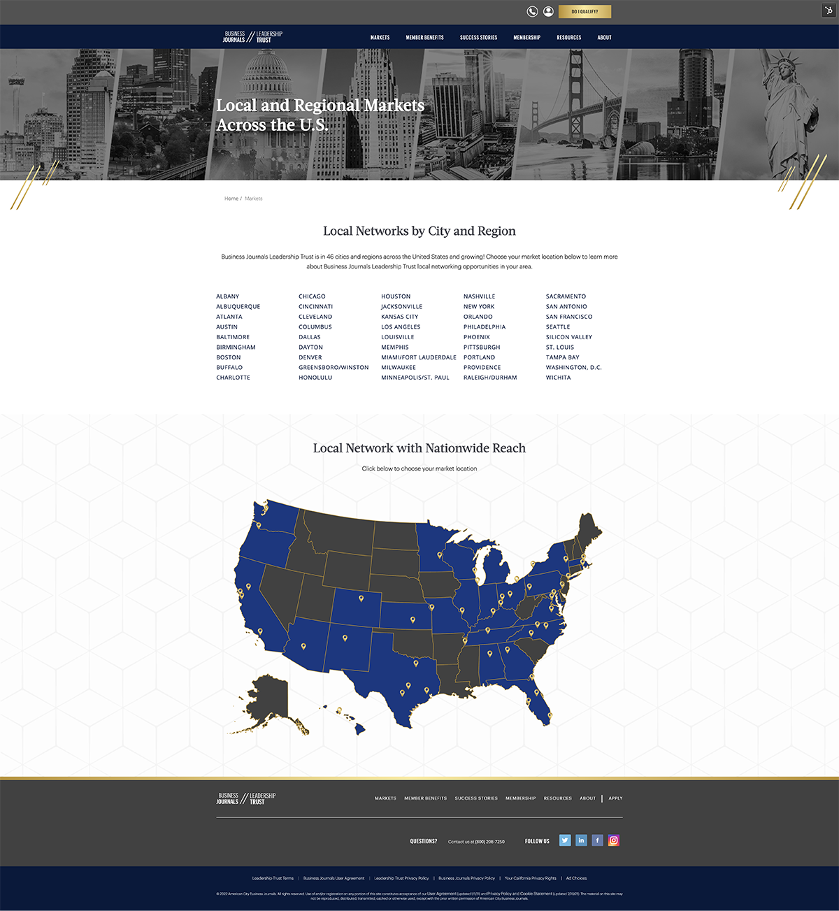
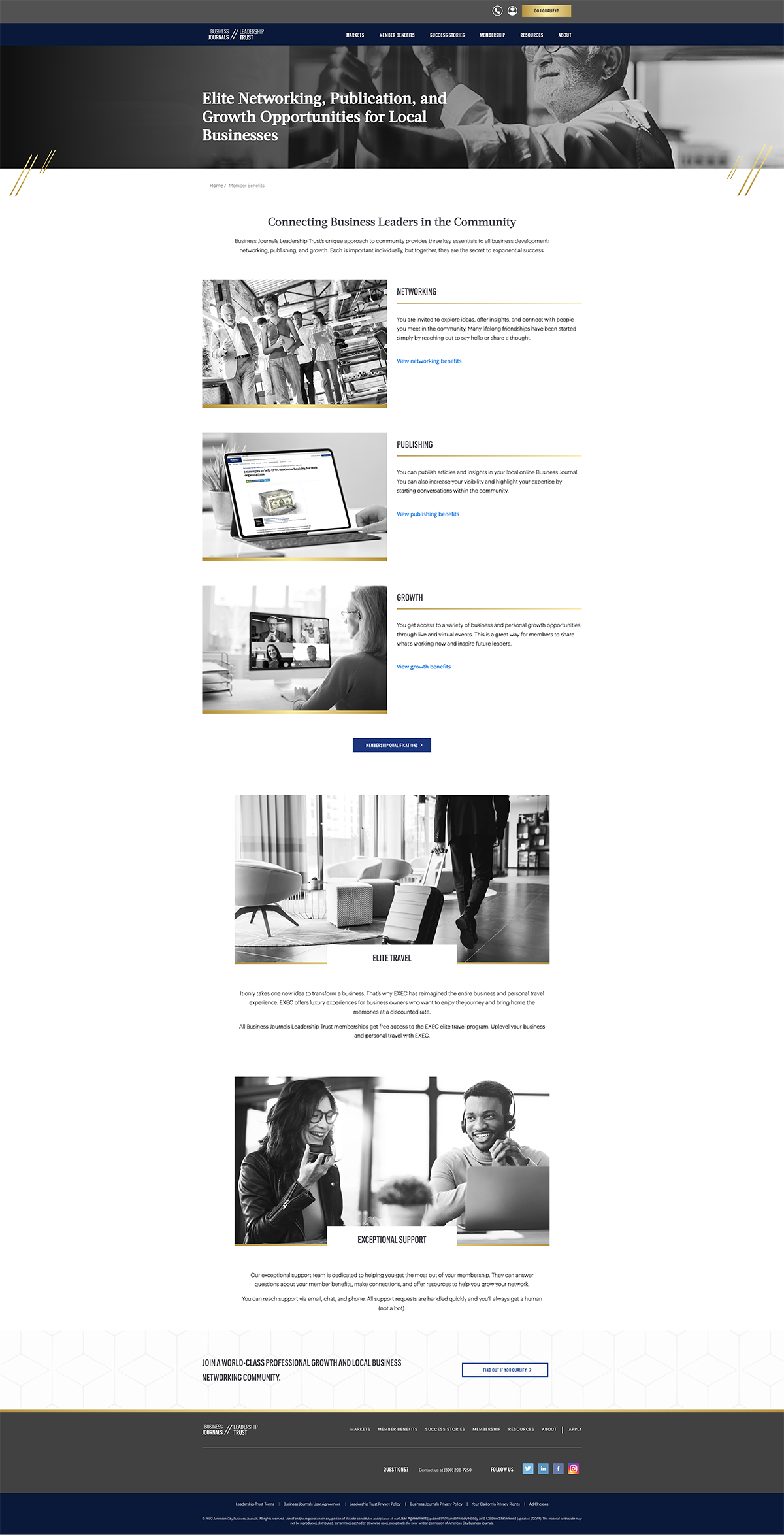
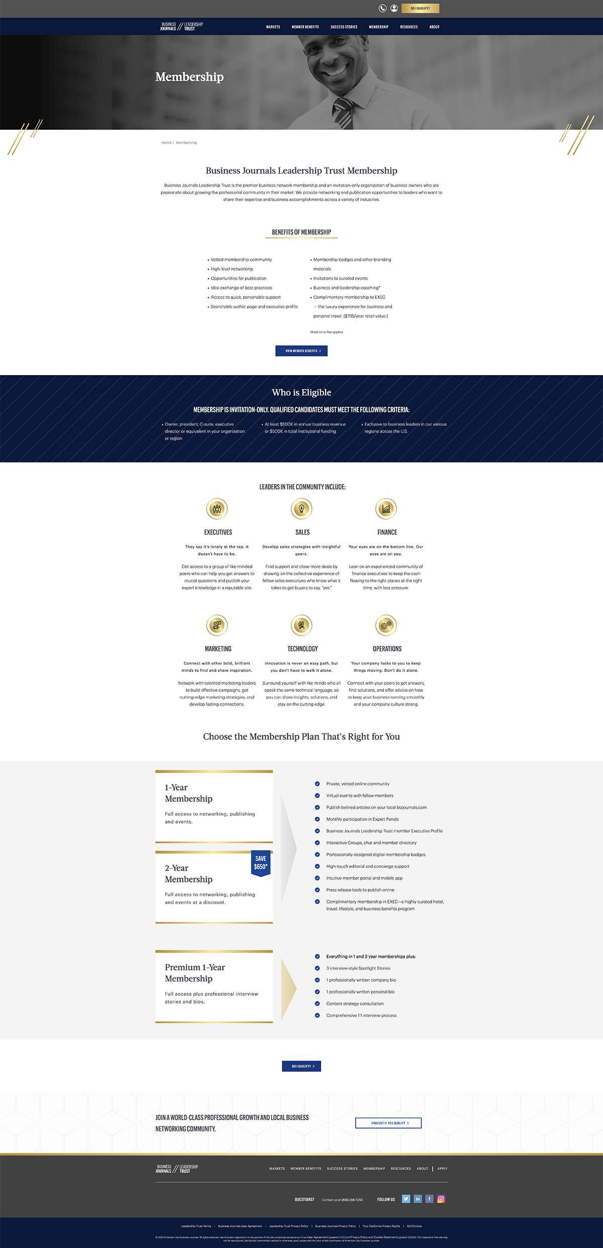
Next, we moved to design where I worked closely with the creative team on how and where to use animations, maintain the black and white style, add blues to give it life, modern serif fonts, and minimum use of gold accents for the high-end feel that the partner liked. We sourced images that represented the existing membership base and used the banner space and headers throughout to add value statements that described community benefits. We also included an interactive map and messaging to show users the impressive presence of Business Journals across their 46 markets in the U.S.
When it came time for development, we defined specific breakpoints for mobile development to ensure ease of use on the go for this busy audience. I partnered with my Developers for full QA, signoff, and launch.
The results:
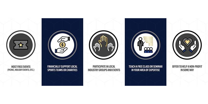
The new website was quickly re-crawled, re-indexed, and ranked for relevant keyword searches now that the on-page, off-page, and technical SEO was healthy. Users spent more time on the 46 markets pages which led to an increase in membership applications. They had a better understanding of what BJLT was and how the community would open opportunities to build local relationships, grow their businesses, and grow personally to increase their success and local impact.
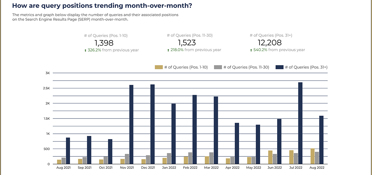
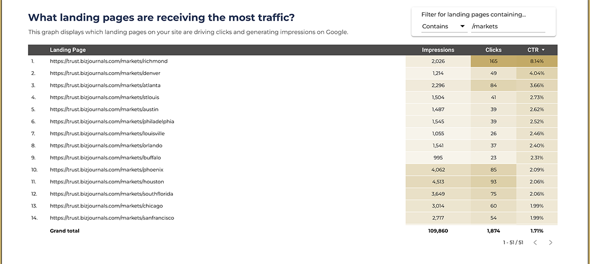
After a few months of consistent content optimizations and new content for organic search, there was an average of 361% lift in search visibility. New brand elements and messaging were also used for lead generation efforts, which consistently resulted in average lead-to-SQL conversion rates of over 50% month over month.
Learn how brand and marketing strategies informed a website redesign and buyer’s journey to grow community for Newsweek Expert Forum.